Logan Square Restoration
A Turn of the Century Mansion
2063 North Humboldt Blvd. in Logan Square, Chicago
View the listing here.

When opening the kitchen up to the dining room, I created connection and flow by bringing the darker wood from the original built-in to the island. The counters are Calacatta gold marble. I chose a very tame slab so I could get the veining without an over-the-top look.

This window was added to the kitchen to overlook the yard. It was sized to match the giant picture window in the front parlor. To get the trim to match perfectly, we salvaged two door casings and crafted this one. The window swings open and tilts down. It's just extraordinary.

To continue the kitchen flow into the dining space, I used the white ceramic subway tile to back the original built-in. I also replaced the wood shelves with glass and added lighting. That created depth and light where it was dark and unimpressive. Now you can fully see the beautiful leaded glass windows on the built-in.

When you entered the home originally you were in an enclosed stairway space, which led to another small parlor space. I created an open hallway straight to the kitchen to pour light into the home. That parlor we carved through became a first-floor bathroom.

The room remains fairly close to the original. And yes, that's the window we recreated in the kitchen.
Every surface has been touched, from new windows (throughout the whole house), refinished wood, fresh paint, etc... But the House of Hackney Wallpaper is a showstopper here, along with the vintage Steinway.

A new iron clawfoot tub felt like a must in this historic home. Paired with House of Hackney wallpaper, it blends a modern and antique look.

I used a lot of Restoration Hardware and Rejuvenation to retain the historic quality but enjoy the new, quality fixtures we wanted.

I love a round table, and this one is centered under the brilliant original crystal chandelier. It throws light so beautifully around the room. Truly magic!

There are so many extraordinary original pocket doors in this house. The one pictured here is larger than two standard-sized doors.

When I purchased the house the fireplace had never been connected. We hooked the fireplace up and it now works with a simple remote control.
We also installed a TV above the fireplace. Can you guess how long it took to find the exact right size TV?

The primary is a light, bright space with two great closets attached to it – a His and Hers. Those plus a William Morris-clad primary bath, creates a truly sweet suite.

William Morris wallpaper is a show stopper against the Carrara marble walls, floor, and counters.

Simple additions like the black pencil marble tile trim and the mahogany toilet seat cover show off that every detail was labored over.

I love when light moves around a space unexpectedly and with variety, so the floors are shiny, but the counters and walls are honed stone.

You can put Moroccan rugs anywhere and the bathroom is one of the best spots. The heated floors toast them up and it's a delightful experience.
The panes of glass go all the way to the ceiling, making the 10ft ceilings more prominent. The pups love it!

I had custom cabinetry installed in the passthrough hall to the larger primary closet. Not only is it an amazing use of space, but I just love all the nooks in older homes. This new addition fits in with the charm and delight of the other spaces in the home.

This room has more open storage than should be allowed by law. Getting ready in the morning is a treat in this dressing space. I love seeing my clothes and not rummaging through drawers to find things.


Steve is the sloth's name... Yes, all of them are Steve.
The wallpaper is from Jimmy Cricket Wallpaper. The "In the Woods" pattern is the most delightful thing on earth.

Who says a girl's room needs to be pink?

Tall ceramic tile wainscoting fits the period of the house, but I added a playful twist by papering above it with Jimmy Cricket's rainforest jungle pattern.
I kept the original pale blue and white floor tile in here. It had the charm, was in great shape, and maintained the historic feel.

This wallpaper from Trustworth Studios is a real showstopper. The pattern is called Hoot. I love the mix of velvets and textiles from ABC Carpet and Home. The antique bed came with the house!

This space was a labor of love and when building it out I had no boundaries. On the tech side, there are two washers and dryers. Not pictured is a full-size fridge, a large steamer, and a giant antique linen cabinet.
When it came to counters I had my heart set on soapstone. The feel is so luxurious and as it ages, it will wear beautifully.

I added little touches like the smart faucet, which turns on with a wave of your hand. You know, messy stuff happens here. Also under all that tile is heat, which Luna loves!

Off the lower level hall is this charming, bright bathroom. The heated circle penny tiles feel period, especially when paired with the subway wall tile in Carrara marble. Above the wainscoting is William Morris's Strawberry Fields Wallpaper.
Paired with an antique mirror, Kohler sink, and Schoohouse bright green sconces.

Building out a lower level can be tricky because there are often weird soffits to deal with. The office space had the same challenge. So I embraced it and created a room outfitted with built-ins. A wall of shelves and a long desk connect to an amazing daybed that feels nestled perfectly into the space.
The daybed features Kravet textiles, including velvet upholstery and embroidered curtains.
If you're a collector or a book person, this is a dream space.

A custom desk is essential if you're navigating a lot of technology. Here I designed a custom desk, including a a super long butcher block counter as a work surface.
The carpet is a large-scale plaid by Millikin. It's got the look but it is super hard wearing.

Here is more William Morris Wallpaper, in their Pimpernel pattern. It's paired with gold Rejuvenation sconces, an antique mirror, and a freestanding vanity that fits with not an inch to spare. I rolled the dice there... phew.
In this space, I used traditional ceramic subway tile for the wainscoting and a luxurious medium-scale hex marble pattern to cover the heated floor.
One thing to note here, and throughout the home, is that I mix metals. Often I use polished nickel for fixtures, then I'll use one or two other metals in the space. I like it when things look curated over time and not purchased all at once from the same pattern.

If you have guests, especially long-term, this extra king suite is a gift for both of you. There is a king-size bed, a large desk area, and an en-suite bathroom. Your guests (and you!) have total privacy. Guests can even work from that space!

This is where I got extra bold and brave. It was a large open space that followed the footprint of the house. We use this as a family space. TV, Legos, fort building, reading, Brio trains, homework, Magna-tiles... This room gets really messy but cleans up fast because the bookshelves were designed to house even the most tricky LPO's (large plastic objects).
The incredible plaid carpet is over new oak floors. It is stitched together and bound about 10 inches off the wall.

The bookshelves were custom-made. The depth accommodates records with space to spare and the height gives us a few inches to spare with large Container Store fabric bins. (Can you tell I am a bit OCD?)
They are lined with Mulberry's Morning Gallop wallpaper in Teal, though it is more of a forest green. The window benches have custom upholstered cushions in matching velvet fabric.

The couch is a hard-wearing one from Arhaus (Couburn). We chose that one because it was super comfortable, the fabrics are everything-proof, and they come in small pieces so we could get it up the attic stairs. We can also move them around in a million configurations. It's perfect for sleepovers!
The issue with these big couches is that they are essentially a blob of one color in the space. So I bought new upholstery fabric from Kravet and remade the couch pillow covers. Adding some Pendelton blankets to the backs of the couches helps break up the one-note fabric too, and the wool absorbs light beautifully.
All the light fixtures in this space are Rejuvination.
The bars will come off the windows when the kiddos get older.

The stairwell coming up to the attic has the same plaid carpet as a runner. It is lined with a collection of oil portraits that make it feel like you are entering Hogwarts. It's a vibe that instantly calms you down from a long day. It's nice and soothing to kids after bath time as they get into the chill zone for bed.

Our hosta garden is amazing. The property had so many very old hostas on it. So the first order of business when landscaping was getting the hostas up, splitting them, and building this lovely walkway.

The backyard was completely reimagined. I bet a lot of people think the herringbone walkways were old, but they are new. I chose a brick that bridged the tones in the house brick and the garage brick.

In spring, the chestnut gets the most extraordinary blooms, so I knew it had to stay. The design of the space had to work around it.

The garage needed a new roof, doors, windows, and tuck-pointing. But once it was all done and that climbing hydrangea did its thing, it became a showpiece.

This angle is looking down from the owl room's balcony. The chestnut tree is in full bloom and shows off the scale of the deck. The deck normally has a table for eight on it and a sitting area.


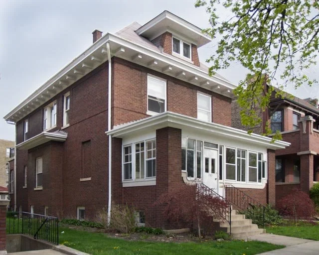
A stately brick, Victorian home. The porch was restored and there is all-new landscaping. My favorite detail is the bead-board on the ceiling.
Information
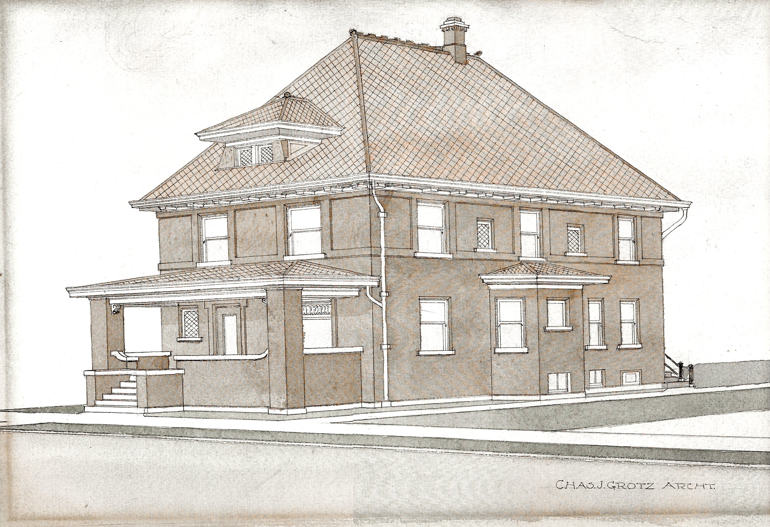
Original Architect Rendering, 1914
2063 North Humboldt Blvd. is a historically-protected home in Chicago's Logan Square neighborhood. The home was recently updated to modern standards while being restored to perfection. A passion project undertaken by Erin Sarofsky over the last 10 years.
The home updates are outlined here on the listing.
We've also had many shoots for commercials and entertainment projects, both still shoots and live-action.
For more information on the preservation of this lovely neighborhood, take a look at the Logan Square Preservation Society's website.
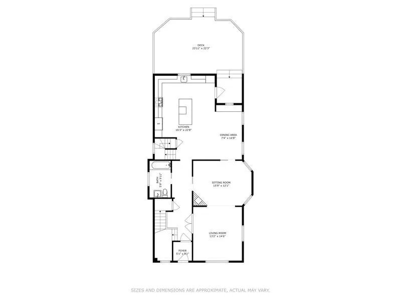
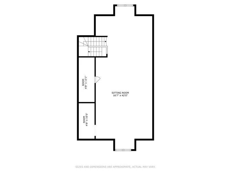
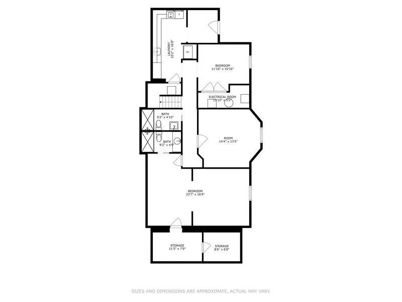
Floor plans
First floor > Second floor > Third Floor > Basement
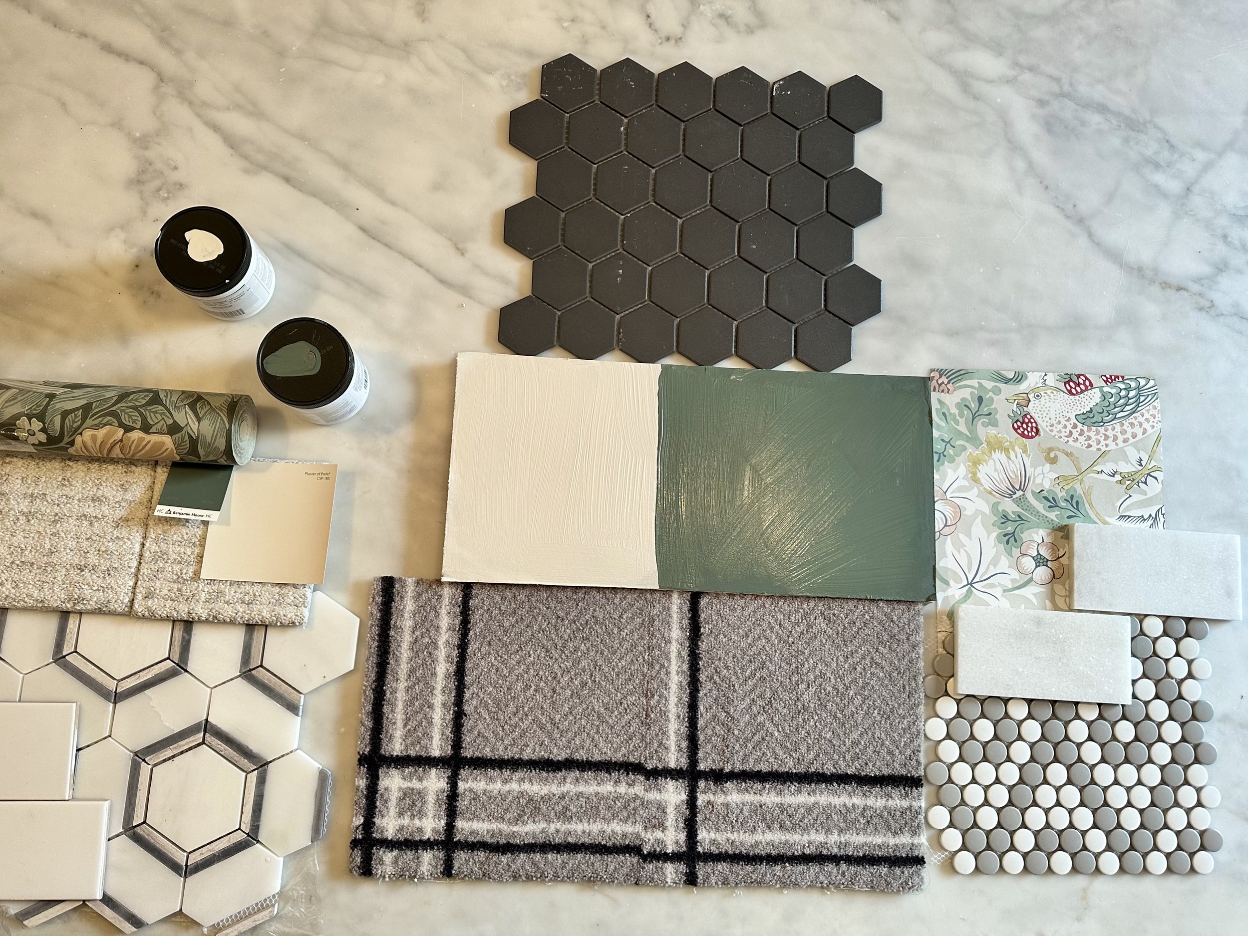
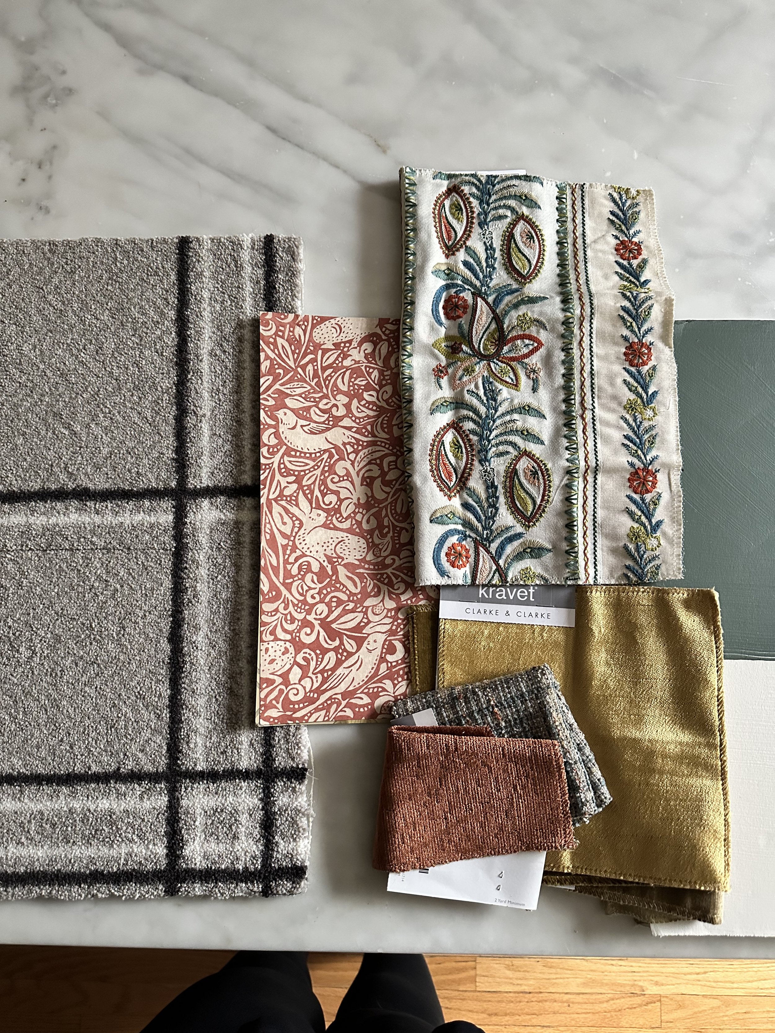
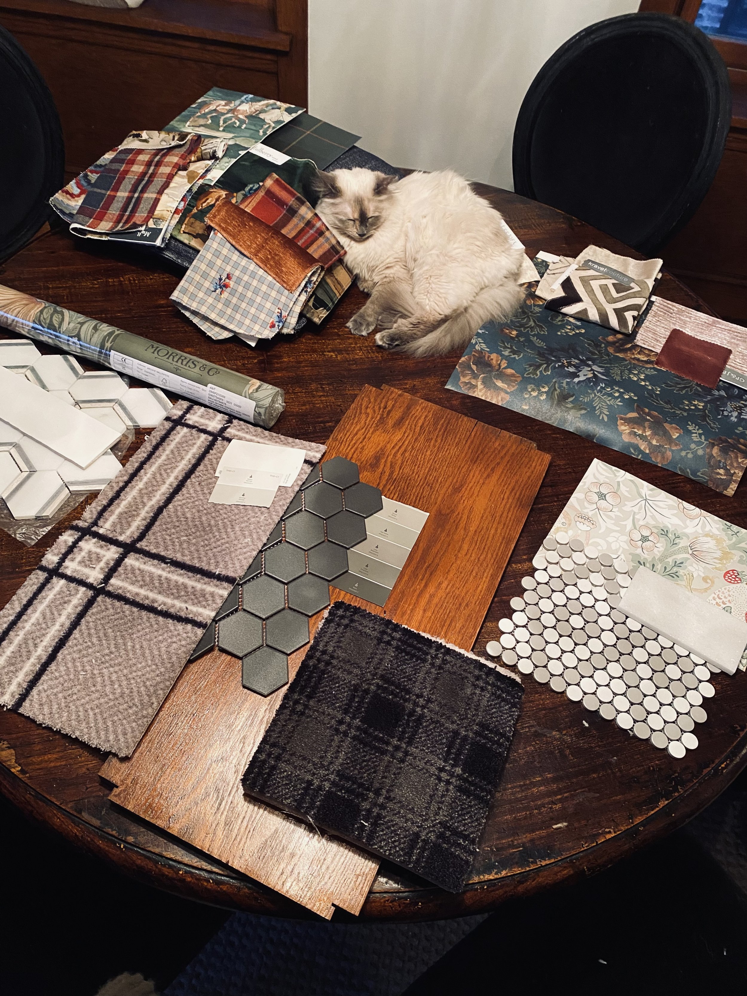
Moodboards
The Before Photos

Oh man, she's a bit bare but in decent shape. One of the first things I knew I had to do was open up that porch. At some point someone turned that into a 3 season room... Total yuck!

This was THE ONLY bathroom in the house. You read that correct. The only bathroom.
The built-in was so charming but it was in very bad shape. I also felt like the layout needed to change a bit for it to be a functional bathroom.

Can someone explain why teal and iridescent tile were added to upgrade this bathroom? Brutal... and it had to go. Along with that sink and a new radiator.
Unfortunately those windows had to go. They were barely holding on... Likely because the bathroom was unvented and the windows were wedged/painted shut. Yikes!


I loved the wallpaper, but clearly it was early 19th century paper and had to go. This did inspire what I put in the front parlor.

Someone had remodeled the tiny kitchen the best they could. The only thing I kept was the cool drawer microwave.


The big AC unit is the biggest tell here about what needed an upgrade. All systems accept the radiant heat were replaced or in the case of AC, it was added.


So many layers of wallpaper.

What. A. Mess. Everything needed an upgrade... And note the roof on the garage. Yikes.


Historical Images


