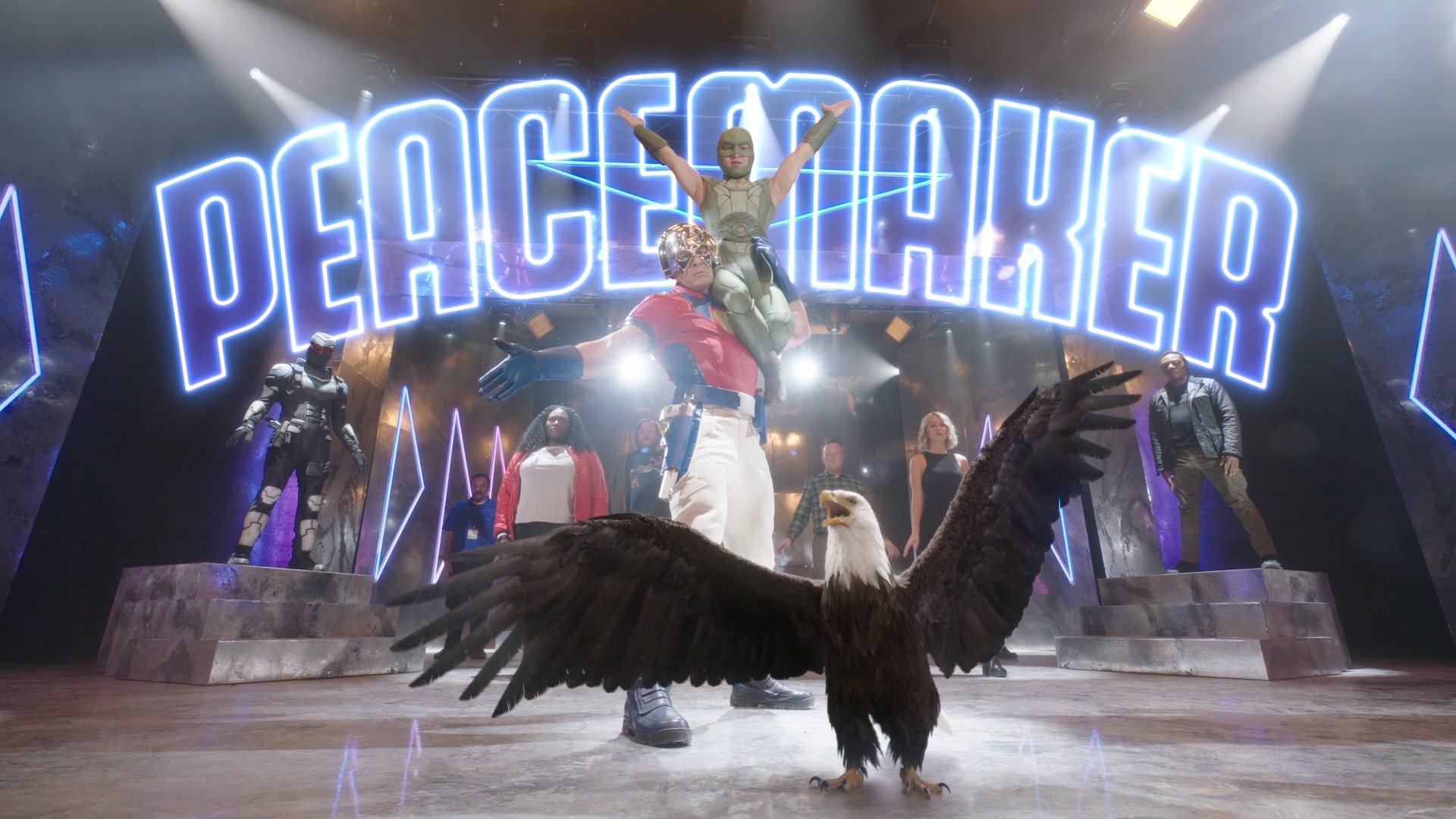
"Peacemaker" Main Title Sequence
James Gunn and HBO Max enlisted our typography expertise in this much anticipated “The Suicide Squad” spin-off — “Peacemaker”. We love the style, the characters and the instantly-stuck-in-your-ear track by Wig Wam that are the backbone of a fun, dynamic, quirky dance sequence. Our typography and main title treatment complemented the badass aesthetic of the sequence and take it to the next level!
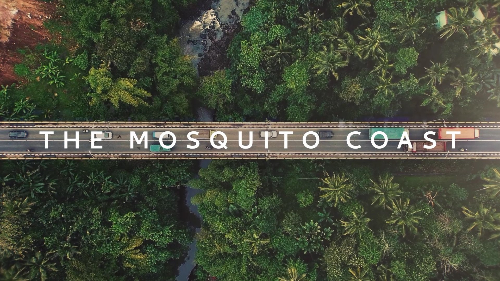
Mosquito Coast Main Title Sequence
Much like the family’s adventure from Stockton, California to the Mosquito Coast in Central America the process for building the main titles was a journey. It’s about creating a sense of tension and claustrophobia. A simple three column grid of footage and space juxtaposing streams of imagery and variously revealing or hiding moments. The entire grid is contained within a frame gradually contracting to nothingness.
In The Year 2525
For the 2020 edition of its flagship annual creative event in Toronto, design and technology event producer FITC engaged Sarofsky to create this epic main title piece.
Set to a new rendition of the classic hit “In The Year 2525,” this rich, iconic animation offers a stark vision of “what we may find,” but does end with a ray of hope.
Music Credits:
“IN THE YEAR 2525”
Written by Richard Evans
Performed by Jon Notar featuring Jean Rohe
Master Recording Courtesy of Groove Guild
Published by Zerlad Music Enterprises, Ltd. (BMI)
Worldwide rights administered by Grow Your Own Music (BMI), a division of “A” Side Music, LLC d/b/a Modern Works Music Publishing
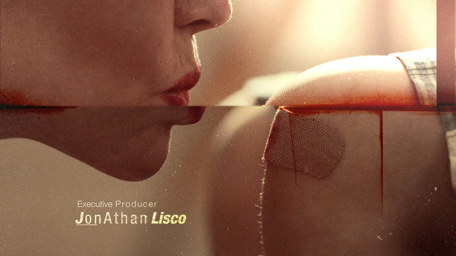
Animal Kingdom, Main Titles
Erin was thrilled when John Wells and Jonathan Lisco reached out to talk about their new series, Animal Kingdom. As she began discussions, they asked her and her team to look beyond the surface of the show. It’s more than just a complicated family drama… And they described how the humor, the Oedipal complex underlying their relationships, the complexity of each of the individual characters and the tension, love and codependency they all share impacts all aspects of the characters’ lives.
In addition to focusing on the complexity of the show’s relationships, she was excited to hear that, like Shameless, they wanted to produce a 60 second sequence and for it to become an iconic representation of the series.
When she came in to create the main title and Atticus Ross was enlisted to do the music. His track is a masterful representation of tone of the series and is a great contrast for our visuals.
As a result, the piece created explores the indelibleness of the family’s relationships, using the tattooing process (which Ellen Barkin’s character undergoes on the show) as a metaphor. In between those tattooing scenes, they flash imagery that relates to the boys’ childhood and their transition to fully realized men. The resulting juxtaposition explores themes that you wouldn't expect to see in the same place, blurring the lines between childhood emotions, adult sexuality and endorphin-educing activities.
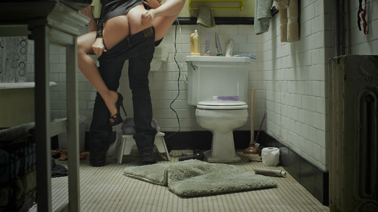
Shameless
John Wells Productions came to Erin looking for a main title sequence that captures the essence of their series “Shameless.” The solution Sarofsky created features all the characters in a way that is both distinctly humorous and slightly voyeuristic. The success of the main title as a portrait of the Gallagher family hinges on its unique location. The bathroom as the setting allows the viewer to connect with the family on a very human level, while at the same time it communicates their circumstances, closeness and innate humor.
This main title won a gold BDA award.

Apple iMac Pro: Erin Sarofsky
Erin was asked to create a piece on the new iMac Pro to demonstrate the most powerful Mac ever. She chose a mixed media approach combining live action, CG (both photo-real and illustrated) and compositing. The concept was simple: bring an old sketchbook and its array of contents to life.
Erin spent two weeks filling a sketchbook with drawings, notes, and doodles. To give it an authentic look, she used watercolor paint and a blow dryer to distress the pages. She then filmed the book using a Phantom Flex camera at 270 frames per second. The next step was bringing the sketches in the book to life. To do that, the sketches were imported into Cinema 4D where they were projected onto a 3D model, which was then animated. The illustrations and models were composited in After Effects and fine tuned, making all the different elements speak to the same visual language.
Groove Guild’s Paul Riggio created mesmerizing original sound design and music. He added lightness, etherealness and a cadence that makes the piece feel wondrous and magical.
According to Erin, it was a thrill to be able to work directly with Apple and their talented group of creatives and producers. She also acknowledged the inspirational level of work by each of the contributing artists, all of which can be seen here: https://www.apple.com/imac-pro/films/
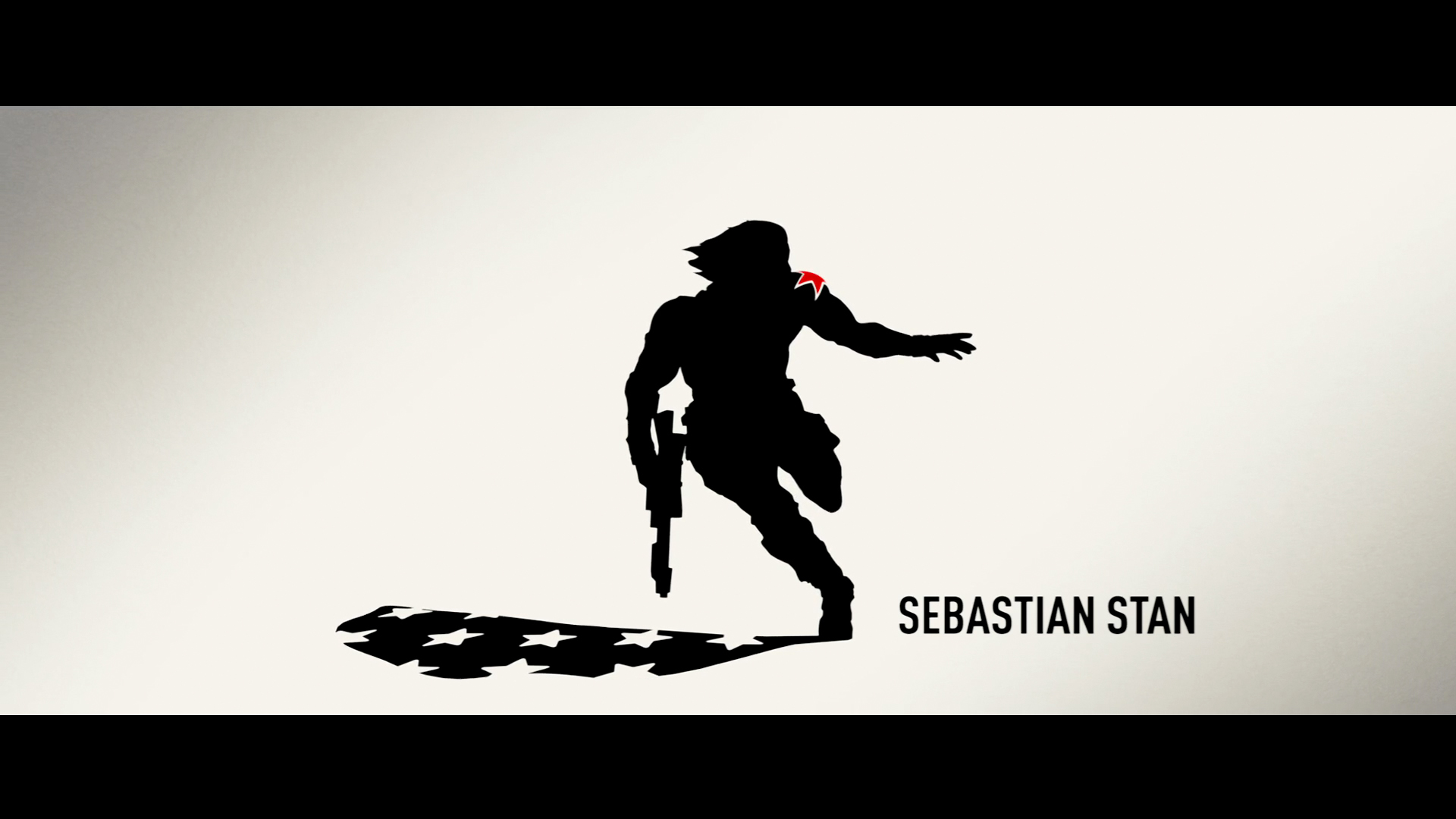
Captain America: The Winter Soldier
Since way back in 2009, we've worked on a few projects with two of our favorite people, directors Joe & Anthony Russo. So when we found out we'd have the opportunity to pitch on their latest project, Captain America: The Winter Soldier, we were absolutely thrilled. Many months later we are excited to finally share the results.
Art of the Title did a very comprehensive case study. Check it out here!
JEEP Renegade "Halsey"
As the DDB Chicago teamed briefed me on “Release Your Renegade,” I knew instantly this campaign wouldn’t be your traditional car commercials. They were looking for a piece that highlighted Halsey, a bad-ass performer who embodied the Jeep Renegade spirit.
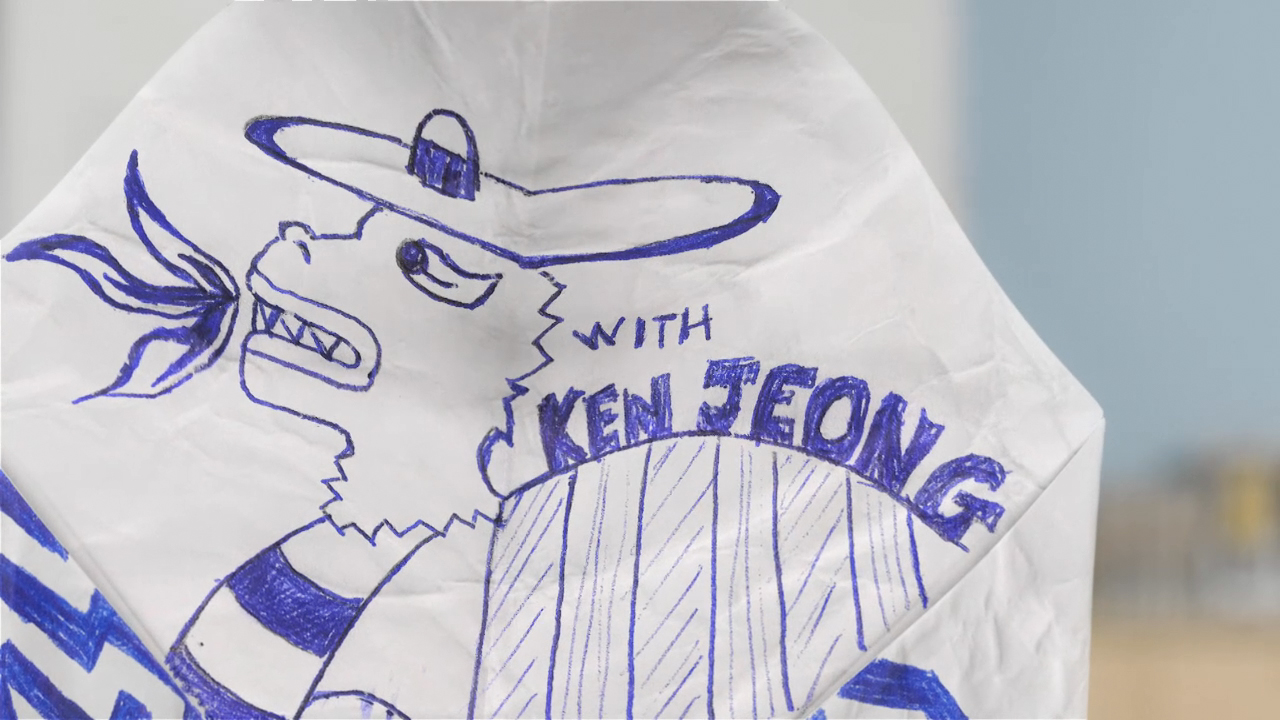
Community
After some discussion and development with the "Community" creators and producer, Erin landed on the cootie catcher as the perfect device to take the viewer through the show's credits. The cootie catcher is inherently amateurish, nostalgic, rich with texture and totally playful... All of which speak to the show and its characters... And it provided the perfect paper canvas to display credits. Sarofsky executed this entirely in 3D and composited the cootie catcher into the actual library where the majority of the show takes place.
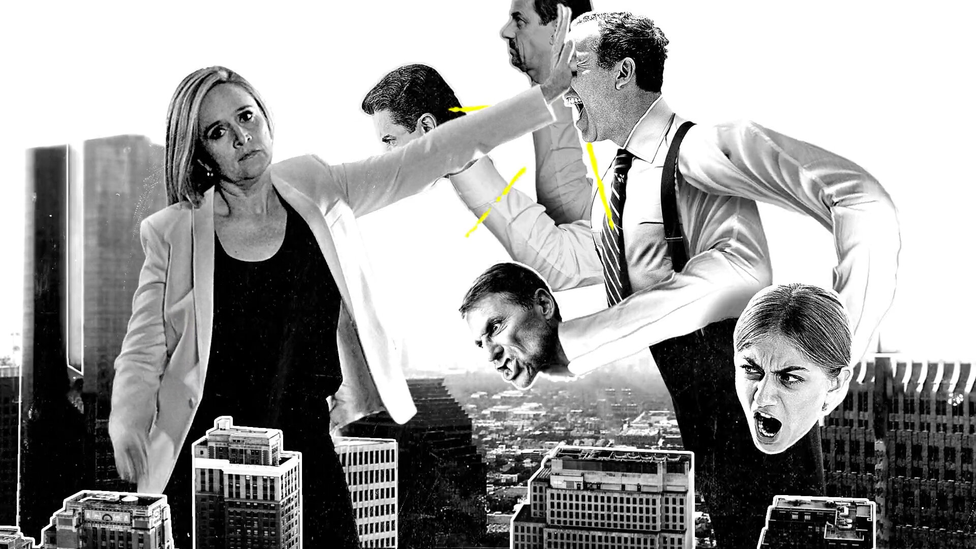
Full Frontal with Samantha Bee Main Title
A monumental surprise awaits viewers of the Emmy Award-winning “Full Frontal with Samantha Bee” in the show’s new main title sequence. Directed by Erin Sarofsky, the highly stylized 20-second introduction presents Samantha the way the world increasingly sees her: as a curious giant in the cultural landscape.
Our chosen approach combines a “punk rock poster” aesthetic with the gigantic Samantha idea. The specific scenarios set a colossal Samantha in familiar terrain, standing up for issues like human rights, legislature, leadership, representation and activism. Donning signature blazer and high heels while towering above American neighborhoods, cityscapes and monuments, she shakes hands (then “fan girls” a bit) with the Statue of Liberty; dismantles and consumes a section of the border wall; spies inside the White House and Capitol; battles a 5-headed hydra of pundits; and rallies a woman’s march… before defacing a poster of herself as she walks off the stage.
“Speaking for Erin and everyone at Sarofsky, I know this project checked all the boxes,” says Executive Producer Steven Anderson. “Bringing in a project that allows everyone to be part of something bigger than ourselves – where we know our time and talent are going into evolving humanity for the better, and that our work will have a voice in a vital narrative – is almost too much to hope for.”

Tic Tac
Noise Vancouver came to Erin to create this fun commercial for Tic Tac Canada. They started off with a screenplay and the idea of a world made entirely of Tic Tacs… And that’s where Sarofsky took off running.
Erin and her team created a surreal environment where the Tic Tacs take us on an exciting journey… Literally transforming from one object to another right before your eyes. The world itself also takes on characteristics of the flavor… Cool, minty and fresh, which was a great direction for us to develop a visual style around.
For music, Sarofsky teamed up with our friends at So Loud Music to create an upbeat track that emphasizes both the refreshing flavor and "Pop Open Fun" tagline.
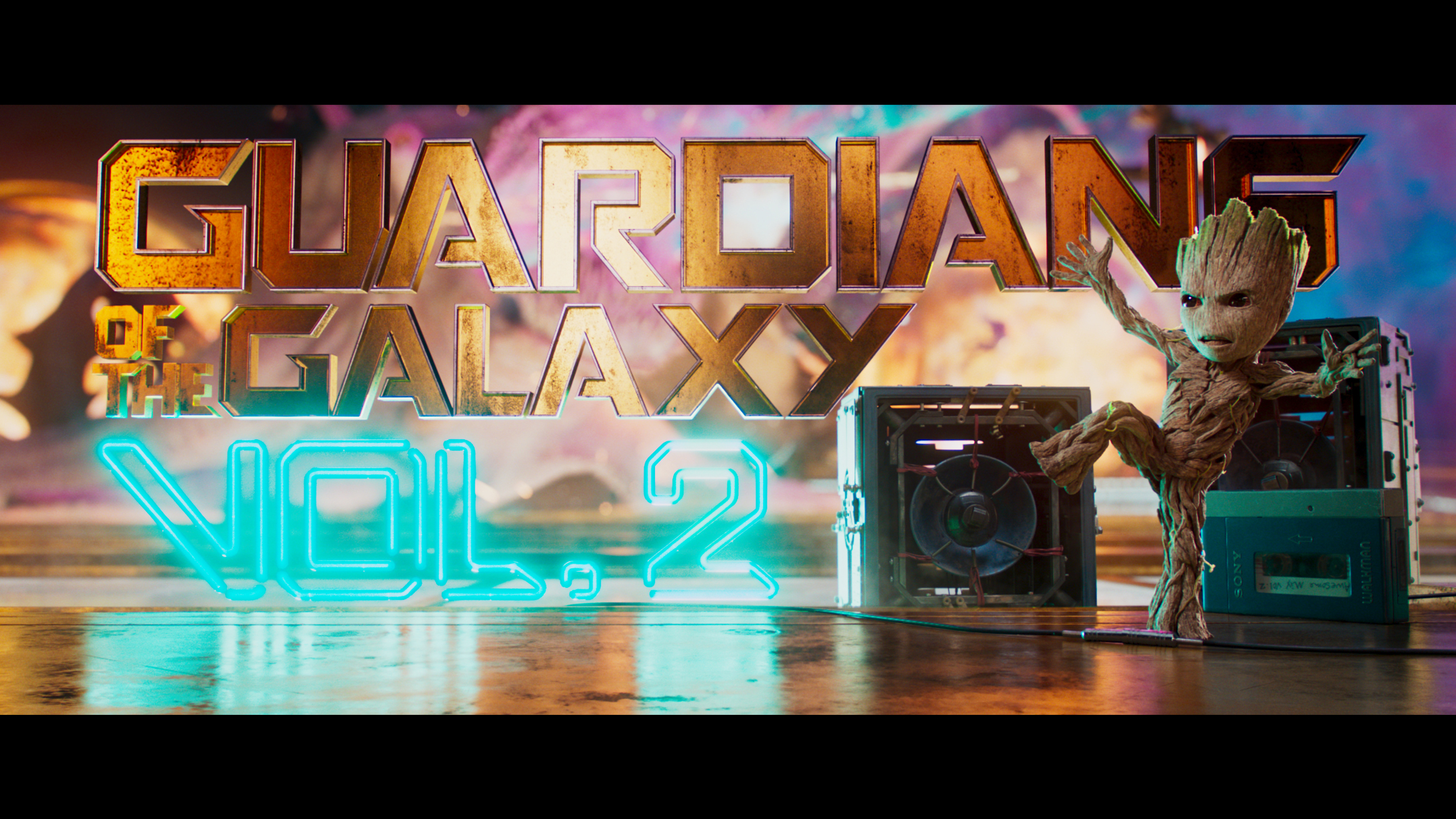
Guardians of the Galaxy Vol. 2 Main Title
Joining forces for the second time with both Marvel Studios and James Gunn, this is the main titles for Guardians of the Galaxy Vol.2. While these titles utilize the custom typeface created for the original movie, they are executed in a totally different way.
While the team at Sarofsky applied our neon treatment to both the logotype and titles, our friends at Framestore integrated them into the final scene. Together, we created a unified and exciting main title sequence for the second installment of this Marvel blockbuster.
--
Also check out the film's end crawl... It's filled with lots of goodies!
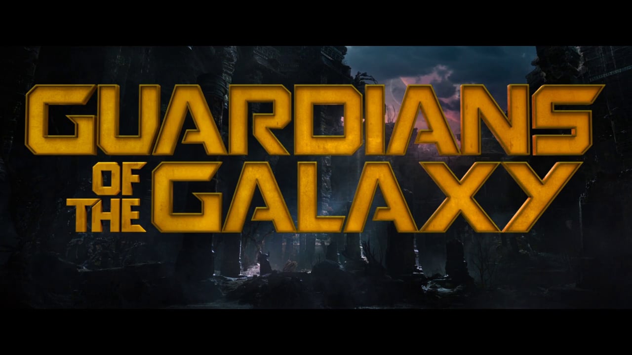
Guardians of the Galaxy
Continuing my relationship with Marvel Studios, Sarofsky just wrapped some title work for Guardians of the Galaxy. We were excited not only to work with the Marvel team again, but also to meet and collaborate with James Gunn, a talented director whose work I appreciate and totally admire.
I was especially excited about the opportunity to create a custom typeface for this movie… Something that is rarely done these days and a total treat to have the time and resources to do.
I hope everyone sees the film. It is truly a great movie... You have the Marvel experience, as well as some good laughs and an amazing soundtrack!
Ant-Man - Main On End Titles
We’re so thrilled to announce another exciting collaboration with the team at Marvel Studios… This time around, we developed and produced the main-on-end titles for Ant-Man, directed by the talented Peyton Reed.
One of our favorite aspects of the film was how they switched scale quite seamlessly. So we used that as the motivation behind our title treatment.
Once we developed the scale concept, we created a look that was totally new and unique in the Marvel Universe. We drew inspiration from the production design surrounding the Pym Particles, which are contained in a glowing, beautiful red liquid. Our solution allowed us to both connect visually to the film without feeling like just another scene in the movie and depict the macro and micro worlds in the same visual language.

Doctor Strange Main Title
This piece connects to the film’s core symbolism and rich, abstract and mind-bending imagery, with a series of intricate animated mandalas. The animation depends heavily on repetition, symmetry and 3D visual mastery... All of it elegantly intertwined with Michael Giacchino’s inspiring score.
--
Are you curious how this was made?
Check out the VFX breakdown.

Friends from College Main Titles
I had the amazing opportunity of working with Netflix and show creators Nicholas Stoller and Francesca Delbanco for these main titles.
The concept I developed revolved around the evolution of the characters from their college years to present through a series of meals and special occasions they’ve shared. From dorm room pizza to black tie events, I covered every kind of meal possible.
Captain America: Civil War, Main On End Titles
I'm excited to share our most recent collaboration with Marvel Studios… The main on end for "Captain America: Civil War."
Inspired by a pivotal scene in the film, the main-on-end titles explore a cracking and breaking concrete environment. Appearing immediately after the film's final scene fades to black, viewers see a debris-laden surface where the first titles are revealed, strongly lit from five angles with spotlights. In this initial frame, even the stones and other objects cast long, dramatic shadows. But in the subtlest of poignant design surprises, when the second title appears, notice that the shadows cast by the words have taken on a life of their own, assuming forms that are easily recognized by fans of Marvel and Captain America.
This was a particularly challenging project for us as it was one of our first endeavors into both photo real CG and feature film visual effects. Look for our design and compositing work in a scene where our heroes receive a particularly sobering message from a familiar face!
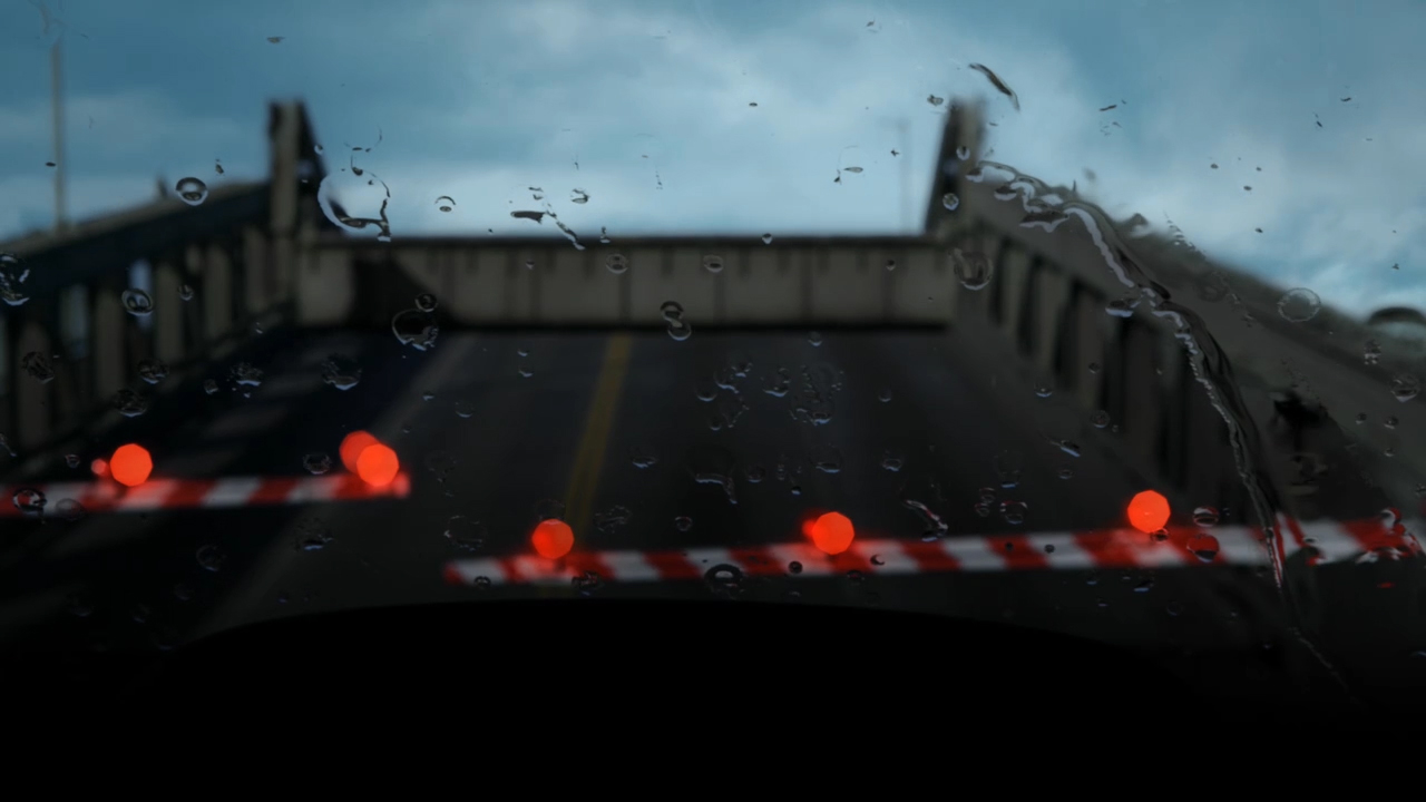
The Killing
AMC and Fuse Entertainment contacted Erin for an opening title sequence for their series, The Killing. In the sequence Sarofsky came up with, The Killing is introduced by taking a journey through eerie, wet Seattle from the perspective the main character, Sarah Linden. As she drives from the city to Discovery Park, multiple environments are seen through the foggy, rain saturated windows of her car. However, throughout the drive, there are also cuts to erratic and fast moving images of a dead body. The sequences introduces the setting of the show, while at the same time, allows the viewer to witness the inner workings of Sarah's mind.
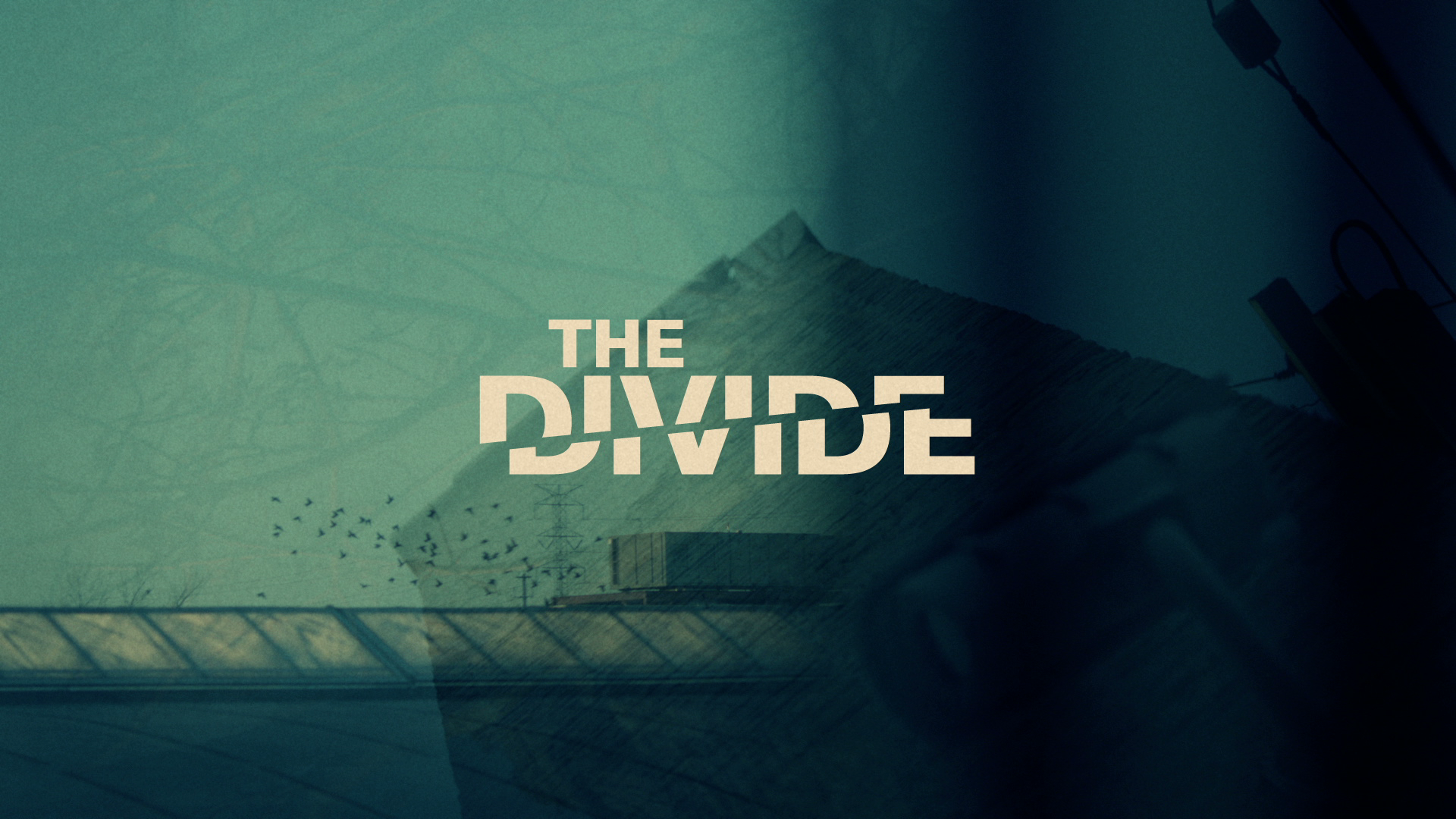
The Divide Main Title
The creators of The Divide approached us with an interesting challenge for a title sequence… How do we communicate the idea of a post-racial America in an untraditional way?
The series, set in Philadelphia, dives heavily into the gray areas of our justice system, where there is no clear picture who is good and who is evil, whether they are prison inmates or respected politicians.
A wonderful city rooted deeply in our country's history, Philadelphia inspired us immediately. The split between classes is still very evident in the city, and we attempted to capture that division in our titles. By shooting into broken mirrors, we created interesting abstractions and reflections and constructed scenes with an ever-present complexity and fractured nature.
Perhaps that was an ominous way of producing the job, because just before delivery, the network killed the whole direction.
Every aspect of the production process, from concept to completion, culminated in a beautiful main title. Even though the sequence has not aired, we are still very proud of the final result.
Ghost Whisperer
The show creators for Ghost Whisperer, Ian Sander and Kim Moses, came to Digital Kitchen to create the main title for their series. The goal was to produce a sequence that acted as a metaphor for the underlying themes within the show: death, afterlife, haunting and searching.
Erin Sarofsky, the main title director, suggested using Maggie Taylor's artwork as the visual foundation of the sequence, because it inherently has the two elements necessary to speak for the series… The visual qualities being vintage and ominous and the themes that related to the series as listed above. The imagery was brought to life through animation and editorial and worked perfectly juxtaposed to an equally foreboding score from Mark Snow.
This main title was nominated for a Primetime Emmy.
--
If you are interested in learning more about Maggie Taylor's work check out her on Artsy.net.
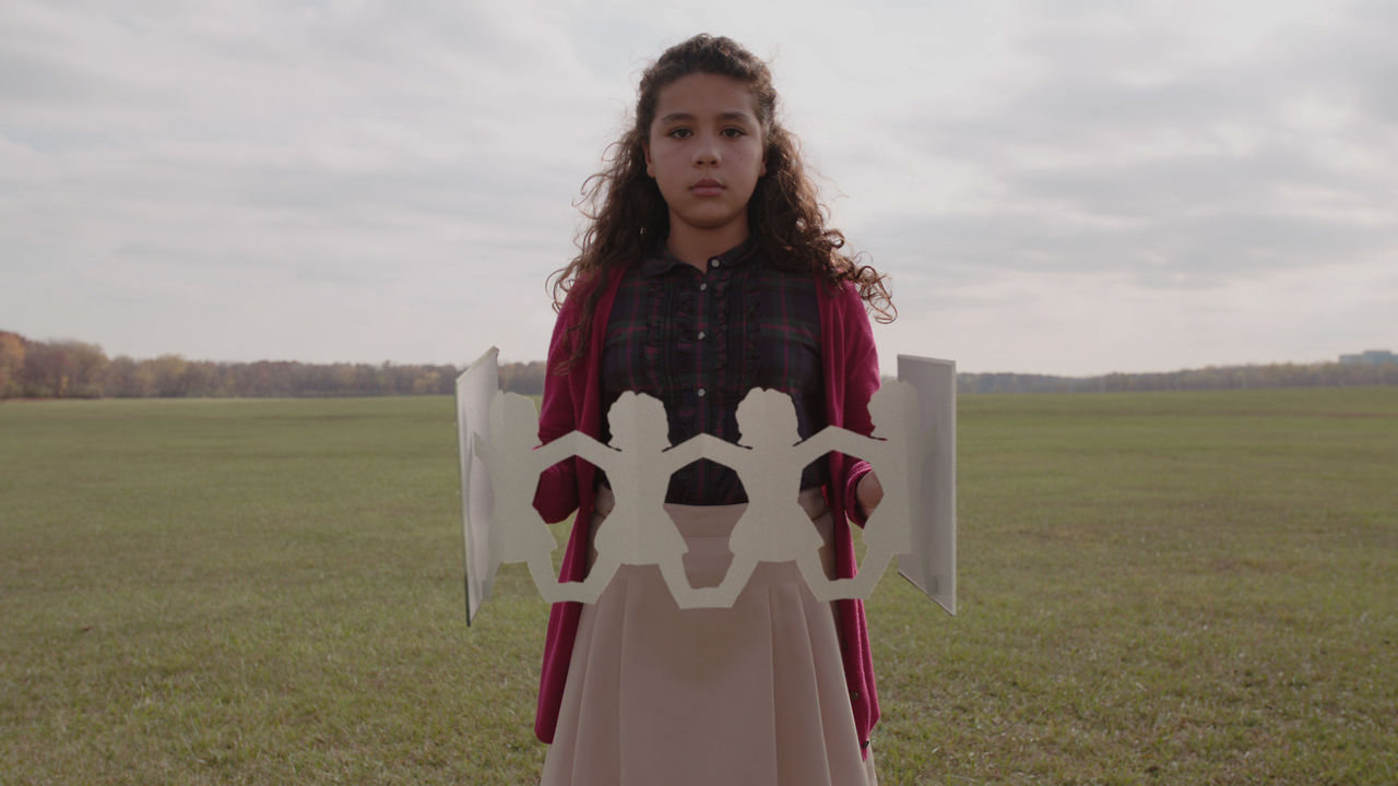
Girl Rising
Oscar nominated filmmaker Richard Robbins came to Erin to discuss his latest documentary, Girl Rising.
This film journeys around the globe to witness the strength of the human spirit and the power of education to change a girl - and the world. Girl Rising consists of nine different girls' stories of how education factored into their life circumstances. Each girl was paired with a female writer from her own country, and then her story was filmed and narrated. Meryl Streep, Anne Hathaway, Selena Gomez and other acclaimed actors contribute voice performances to the film, which also features original music from Academy Award winner Rachel Portman and Grammy Award winner Lorne Balfe.
Robbins’ approach to the film created a unique challenge: how do we create an open and interstitials that add a depth of knowledge and global context, as well as maintain the flow of the movie? That's where Sarofsky helped. After lengthy discussions and numerous script revisions, Erin and her team developed a series of scenarios that feature a group of girls, who present important statistical information in both a playful and filmic way. Combining our visuals, Robbins’ writing and Liam Neeson’s voiceover made for not only a beautiful piece, but also an effective way to weave the different stories together.
In the end, Sarofsky is proud to be a part of a project that delivers a simple, critical truth: Educate Girls and you will Change the World.
Work Gallery: Movies
Erin Sarofsky is the internationally heralded creative visionary regularly chosen by brand and entertainment titans to lead their most artful storytelling projects
In 2009, Erin Sarofsky launched Sarofsky Corp. in Chicago’s booming West Loop. Recognized internationally for brilliant design-driven production that is limited only by the imagination, Erin and her firm have forged longstanding relationships with proven leaders of the advertising and entertainment industries.
Under Erin’s leadership, Sarofsky is well known for creating gorgeous, innovative main title sequences for blockbuster movies and television series, including “Captain America: The Winter Soldier,” “Guardians of the Galaxy,” “Ant-Man,” “Doctor Strange,” “Animal Kingdom,” “Shameless” and many others.
Over time, Erin’s artistry has expanded exponentially in every conceivable way, including in style and medium. Stylistically, she constantly breaks new ground as a live-action director. Recent examples include her mesmerizing macro imagery that sublimely introduces each episode of Animal Kingdom … and her patent, iconic look brought to life for Jeep’s three-spot “Release Your Renegade” campaign. There’s also her signature, original marketing piece written and directed for Apple, which earned acclaim from the brand’s audiences worldwide.
Increasingly focused on developing original content, Erin’s future is building upon all her success. That includes her pivotal directing contributions to documentary projects like documentary “Girl Rising” and a series in development that she created and co-wrote… and her unbridled desire to tell important stories on the world stage, using the full powers of design and cinema.